Sunday 31 March 2013

Taking photos for double page spread

During the half-term i have decided to take photos for my double page spread. I'm aiming to take different sort of photos that will represent the people like they are on the spot- what I mean is that the theme is going to  be interview so i want those photos to be close up on their  faces. I have to try to take 3 different photos with the same people that will relate. I need to choose 3 different photos that will reflects to the audience.


I like this picture as it reflects the models face with the background that is slightly darker. I’m afraid it may not suit it as the background of the page is white. The model also created shade which may not go with the page.


I like this picture as the background is white and it cause lighting at this page. It may be the main attraction to the page and make the audiences look at this picture. It is same colour as background, but may be different than other pictures. It shows that she is the main feature of the magazine.


This picture will show the feature of the boy’s band. This picture shows connection between those boys and happiness. This is really good picture and I would like to use it on my double page, I believe it will reflects the article.


This could be  one of the pictures on my double page as it shows all the creatures that will be represented on my text, I like this as they all look serious as well as fun and played full I can see connection  between  those people represented on picture which is the sort of look I wanted to create.  


This is picture I’m definitely going to use on my double page spread it shows connection between two models and happiness as well as fun which is reflection I would like to use as my magazine is directed to mainly teenagers that will like their artist to be funny and love story which may lead through this picture as models are looking into each other eyes.

Thursday 28 March 2013

Double page spread- Photo-shoot planing

Photo-shoot planning sheet
Title:
Double page spread photos

Photo-shoot concept:
Photos will need to be taken so it will represent people that are R&B and POP artist who are really entitled with music; close ups on their face with happiness and emotions showed. These pictures should represent more than people.

Aims:
From this shoot I want to persuade readers to buy this magazine. I want people to look at the artists represented on these photos and wanting to be the same. I will try to get people attraction and clear message about this magazine and what this magazine represents. I want this representing people to look alike my target audience and also show that they are normal people not much different to their fans. As my target audience (mainly teenagers) like to compare their selves to people that is not much of a start but normal people.

Date and timing:
These pictures will be taken during day time and that light will make the pictures look natural, I’m planning to take those photos between 28th March and 30th March. The pictures will be represented on white background with slightly darker lighting.

Location:
The picture for front cover will be taken in doors; to give a natural look to the pictures and make them look clear, as this page is going to be in white/creamy and black colours pictures on white background with suit with the page.
Props:
The costume that will be required will have to suitable and similar to the fashion that the target audience ware. The boys will be wearing hoodies that are very comfortable, whereas the female will look smart she will be wearing white shirt with scarf that will reflect what the boys are wearing. 

Model:
The model will have to be female in the age between 16years old and 24 years old, so it is representing the target audience age and will bring their attention. The model will have to glamour make up and represent music. The male will be between the age of 16 years old and 24 years old they will have to look slightly older than a female as the stereotypical band is where he man are older and they are taking care of the girls.

Team:
Photographer, artist make-up, hair stylist and fashion adviser. Those people will work with the model to make sure this will look professional. 

Equipment & Preparation:
I will need to have camera and spare batteries as well as memory card. Make –up and hair equipment’s as well as prepare cloths with the fashion stylist. I will have to book an appointment with those specialists and as what also I will need to prepare. Ave meeting with my models and tell them what I’m planning to do.
Desired Shots (Draw sketches):
I could have extra lights so the background will be much lighter as the model will be represented in dark as well as light cloths so I will have play round with the lighting.  The shoots will be taken as mid shots or close-ups. I will prepare the model in different positions to see what I would like the shoot to look like, and then I will take different photos.  I will also produce storyboard representing different shoots and ideas to visual my ideas.

Reference images:
I will print images and sit with the model and all advisers and we will discuss each picture we will decide which one we all agree to use. I will also produce mood board to see which picture will suit the target audience.

Picture that inspire me:


I like this picture as it reflects the models feminism. Even though the background is quite dark and the models in a brunet she is also reflecting on this picture, the background is very nice and suits the image. Image is clear and shows really good quality I think it is very persuading.


This picture is very similar to the one above, but his model is concentrating on the audience which will make them feel like his article appears to them. The model stands out on this picture. This picture look fresh and the models shows happiness which is a sort of message I want to give to me target audience.

Wednesday 27 March 2013

Double page spread research.

Here is a research I have done for Vogue magazine.


Research for Heat magazine:
Research for Q magazine :


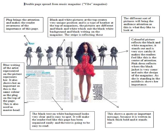
Research for Vibre magazine:


What I should include into my double page spread?
From the research I have done , I will use those facilities that  I like and use on my double page spread, even though I have planed my double page spread in the way I want it to look like I will still get an idea from my research .

  • Caption- it will be a description underneath a picture, so this will anchor the image and help the reader to get more idea about it. 
  • Brand identity- this will make the reader feel like this double page spread is related and important for the magazine brand. Audience will find this really easy to recognise. 
  • Byline- name of the journalist at the end of interview. So that the reader can see who have written this article as well as this prof that it is actual interview. 
  • Excursive tag- I will include this on my double page spread, so that the readers will have the feeling that it is available only in my magazine and it will promote my magazine. the reader will also feel the importance of this article. It will be persuading.
  • Gutter- space between the writing in centre, so that this will create the look of columns  Audience will find it easier to read from this will also make the article look clean and neat.  
  • Headline- heading that is going to relate to the story in order to promote it. 

Saturday 23 March 2013

Content Page

Here is a Content page I have created.


Changes I have made:
I have changed the title of the content page possition instead of placing it in the left hand side and adding headding underneath it as well as the name of th emagazine on the left hand side of the maagzine. The half of the page with the picutre of the model I have discribed by adding sub feature title which adds discription about this picutre and what deos it representes. Where I havent change the other half of the page as much but only by placing picutre in the right conner of the magazine.
I like this magazie as it hsows many different features and links with the cover page by the name and logo of the magazine I have placed. I have used different fonts colours and sizes to attract my target audience .
I hav aslso changed the background oclour so it adds more reflection and suit the main picture.

Friday 22 March 2013

Questionnaires about my Cover page.

I have produced these questionnaires in order to see what my potential target audience think about my front cover.  I will use this answers to make improvements and have more idea and others opinions about future.
Here is a copy of the questionnaires I have produced.
Here are copies of answers I have recieved :


 I have asked 5 different female in different age groups. He feedbacks I have received quite positive feedbacks. I can see that the price is very important, because it is cheap and my target audience are mainly student cheaper magazine is persuading them “it is cheap” answer one of the people I have asked.
From the feedbacks I have also found out that others like my subtitles and find them interesting which is the result I have tried to achieve. The picture also shows emotions, but based on others opinion I could add more colours to make it stand out more and eye catchy. One of the persons told me that this cover looks like the target audience are teenagers which is very important as it is very colourful.
From the feedbacks I could add more improvements like
·         Making titles bigger.
·         Add more pictures
·         Add more colours to the pictures
The people I have asked questionnaire were between the age of 16- 23.
That are my potential target audience.   

Thursday 21 March 2013

Taking photos for Content Page


Today I have been taking photos for my content page; I have found it very difficult. It is not easy to take a good picture that can reflect all I need and want thorough the pictures. I really liked picture from one of my designs and I have tried to get very similar result. The picture I was looking for will have to represent music and also give the reader interested.

After I have taken these photos I have commented them with the model and we have chosen the picture we both really like. I also represented to the model the sort of content picture I want to have.


I like this picture as the model looks very concentrated on the camera. The face of the model is very smooth and her dark hair reflects the dark cloths she is wearing, which makes her stand out on the white background that looks very clean and I can reflect the model.


I like this photo as it looks nice and clean. The model is looking up which is a negative point where the reader have not got the awareness of the model looking at them and concentrating.


This picture is not the best quality, but I want to talk about the story of happy singer that is uploading her life story on her blog and shearing her ideas. I like this picture this is what I was aiming for which is a picture showing happiness and picture that is not made from professional camera.


This picture is very nice and clear it shows the message of the model being relaxed and confidence. I don’t like this background as what I wanted to get was a white background or the model will need to be cut out. I also like that this picture was taken from the low angle which will make the reader feel of the model represented more powerful.


 I like this picture it looks nice and the model looks relaxed. The picture was taken from low angle which is different and looks unique. This is not the picture I was looking for and I haven’t found it convincing. I don’t like the lighting.


Here is a list of different range of photos I have took.


Wednesday 20 March 2013

Cover Page


Cover page

I have created my cover page; it was very difficult and caused a lot of struggle. I have tried to add colours that will suit my target audience. I have used a stripe with different CD’s that I find really effective, the page stands out and brings the audience attention. This also relate to the music theme, where the prices I have put on the magazine will bring more attention where my target audience are mainly unemployed so low prices will attract them. I have placed the barcode serial number and date in the left side of the magazine. The model is placed on the right hand side of the page so that I had some space to place the main features.

The picture is very light that is mainly reflected by the lighting and the cloths that the model is wearing. The model is also blond which creates creamy colours on white background. The magazine is mainly in light colours that look nice and clean. The picture is black and white, which gives more colours and reflects on the page. The model also shows a lot of emotions. The audience will look at her face and reflect the task saying “Celebrity secrets” which will make the reader more interested in reading this magazine.

I have used different font sizes and styles on this magazine, to bring the audience attention. It looks clear and different. I have used this as this is teenager magazine and this is what this ground of audience will want to look at.

Changes

I have decided not to use white background, but slightly grey and creamy in order to add more reflections. I have also placed added puff to make this magazine more interesting and add more information about this magazine. I have decided not to put picture of guitar, but add plug saying about voucher’s available in the magazine, as tis will bring the audience attention. I have also took a long shot picture that shows more emotions. The character is showed as more emotional person with more reflections. I have also changed the master-head that is in pinks colour with yellow around the title. As it adds refection’s and appears to the target audience which are teenagers/ young adults that like to have a look at colourful magazine. Instead of adding stripe with cloths I have added stripe with different pictures of albums that will reflects with the music theme of the magazine. The CD’s also represents R&B music which is my main theme and target of the magazine.

Thursday 7 March 2013

Content page design

  Today I have created my content page design. I have used a lot of ideas from my research in order to create this. I want my content page to stand out and grab my target audience attention.